Are you planning to buy a diamond initial necklace and wondering what font you should choose? Then you have found yourself in the right place.
Buying a diamond initial necklace is an extremely personal procedure which includes the difficult decision of choosing a font. With so many options available, we want to choose something that reflects our personality, so the necklace truly feels ours.
How to Choose the Right Font for Your Diamond Initial Necklace
Serif, sans-serif, or script — the font decides more about a diamond initial pendant than the diamonds do. Here's how to choose the one that actually looks like you.
Key Takeaways
- Personal style Classic, minimalist, or edgy — the font should reflect the wearer, not a trend.
- Readability first Ornate fonts shrink badly — keep it legible at pendant size, not just on paper.
- Match it to the occasion Romantic script for anniversaries, modern sans-serif for daily wear.
- Size the font to the pendant Compact fonts for small pendants; bolder, more intricate ones for larger pieces.
- Pair the font with the metal Serif suits gold's warmth; sans-serif suits the cooler tone of silver or white gold.
- Know the current trends Calligraphic and geometric styles are having a moment — worth a look before you commit.
- Consider hand lettering A custom or handwritten font adds a personal layer no catalogue typeface can match.
- Preview before you order A mock-up against the real diamonds and chain length is worth the extra step.
In This Guide
- 1. The Personal Style — the font should sound like you, or whoever you're buying for.
- 2. The Readability — why decorative fonts can work against a small pendant.
- 3. The Occasion — everyday piece or milestone gift, the font should know the difference.
- 4. The Size and Design — matching how bold a font is to how big the pendant is.
- 5. The Metal — why gold and silver call for different font families.
- 6. The Trends — what's currently popular, and how much that should matter.
- 7. The Fonts In a Nutshell — serif, sans-serif, and script, broken down simply.
- 8. Personal Touches — hand lettering, and how far you can take "custom."
- Test The Diamond Initial Necklace Font — why a mock-up saves you from regret.
Buying a diamond initial necklace is an extremely personal decision, and choosing the font is often the hardest part of it. With so many options available, most people want something that reflects their own personality — so the necklace ends up feeling genuinely theirs, not just a letter picked off a shelf.
Font is the decision most people skip past on their way to picking diamonds and chain length — and it's the one that decides whether the pendant actually looks like you. There's no single right answer, but there are real factors worth weighing before you commit: your own style, the metal, the occasion, even how small the letter ends up being. Get those right and the necklace reads as chosen, not just bought.
1. The Personal Style
Let's start with style — yours, or whoever you're gifting the necklace to. Is it all about that classic, timeless look? Or are they more into modern, minimalist pieces? Maybe they lean edgier than either of those. The answer decides the font family before you look at a single sample.
Classic elegance points toward a serif font — something with the weight of Times New Roman. Contemporary and minimalist calls for a clean sans-serif instead.
Picture a friend who lives in vintage clothing, wearing a gold diamond initial necklace with a classic serif font — it suits her instantly, in a way a modern typeface never would. But if she prefers clean lines and contemporary aesthetics, that same serif font just isn't true to her. A simple, subtle sans-serif would be the better choice, every time.
2. The Readability
While aesthetics matter, readability matters just as much. Fancy, ornate styles are tempting and can look beautiful on paper, but initial necklaces are small, and some fonts simply don't translate well onto a pendant.
We recommend avoiding overly decorative fonts that can be hard to read once they're scaled down to a few millimetres. Clean lines and balanced spacing — something like Helvetica or Garamond — offer both style and readability, which is exactly the combination you want in a piece you'll wear every day.
A useful test: if the font is hard to make out at normal reading distance on a screen, it will be harder still once it's cast in gold and set with diamonds at pendant size. When in doubt, simplify.
3. The Occasion
Consider when you'll actually wear your diamond initial pendant. Casually, every day to the office? Or are you saving it for special occasions — anniversaries, milestone parties? If it's not for you and you're buying it as a gift for someone special, is it for a wedding, a birthday, or simply an expression of affection?
The purpose of the occasion can help you choose the right font. A sophisticated script font carries a romantic feel and suits an anniversary perfectly, whereas for an everyday piece, a modern sans-serif font keeps it stylish but low-key. The age of the person you're gifting to plays a role too — younger women tend to lean toward bold, chic designs, while older women often want something more traditional.
Also Read: 9 Trendy Initial Pendant Styles to Elevate Your Look
4. The Size and Design
As we just implied, the size of the diamond alphabet letter pendant can make or break the accessory. For smaller necklaces, simple and compact fonts work best. For bigger pendants, it's easier to be creative with bolder fonts.
The size ultimately comes down to what you're aiming for. A subtle, delicate design shines best at a petite pendant size. Larger pendants can carry intricate fonts that genuinely make a statement — the extra surface area gives an ornate letterform somewhere to breathe.
If you're torn between the two, err toward simplicity. A compact font on a larger pendant still looks deliberate; an elaborate font squeezed onto a tiny one tends to read as cluttered rather than considered.
5. The Metal
When you're picking the font, think about the metal you're choosing too. Gold or silver, whichever metal you go with can genuinely influence how the font feels and reads.
A serif font looks stunning on a gold diamond letter necklace — there's a real sense of luxury and warmth to it. White gold or silver, on the other hand, sits in a more modern, crisper setting, which is where sans-serif fonts do their best work.
Gold tends to carry more detailed fonts well, making it a strong choice for ornate or script styles. Cooler tones like silver enhance simple, contemporary letters instead. Pair the right font with the right metal and the necklace shines in a way that mismatched pairings never quite manage.
6. The Trends
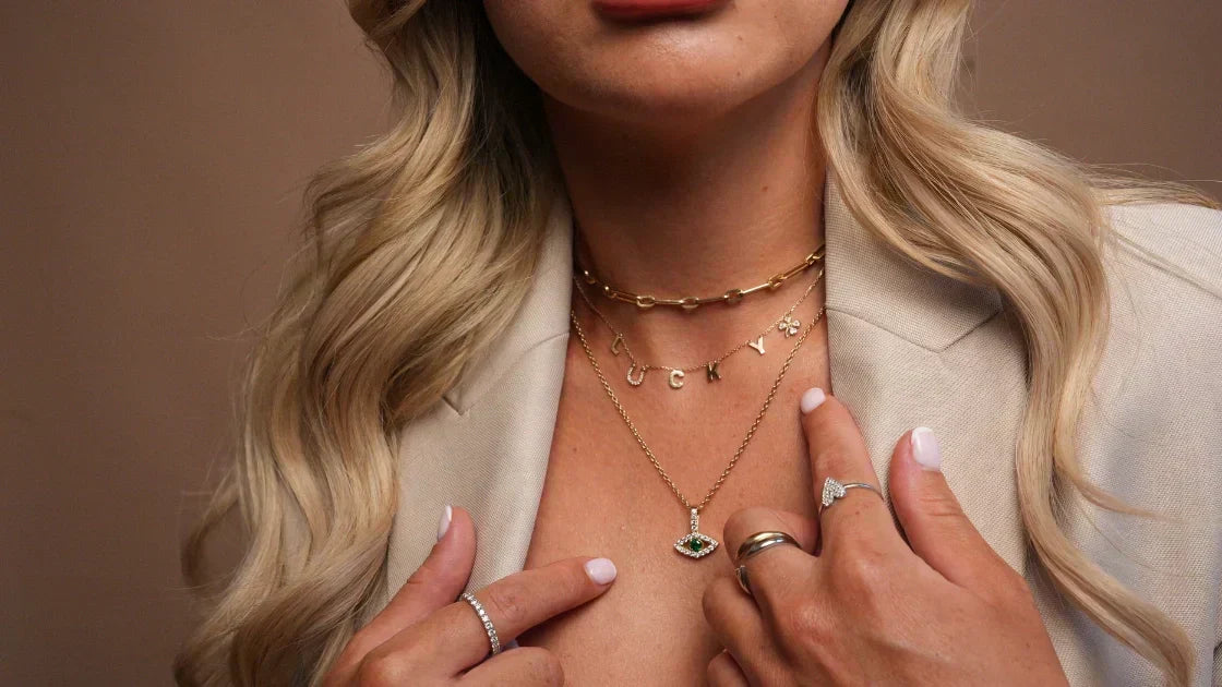
If you want to stay up to date with the latest styles, it's worth checking the current trends. There are many popular choices for diamond initial necklaces right now — calligraphic, geometric, and classic among them. Keeping an eye on such trends helps ensure your necklace feels modern and fashionable rather than dated.
Scroll through Instagram and Pinterest and you'll find plenty of influencers and jewellers offering everything from bold fonts to delicate cursives, suited to different tastes. Celebrities are frequently spotted wearing initials in various styles and attires, which makes them a reasonably reliable barometer for what's current.
That said, trends shouldn't override the earlier factors. A font that's everywhere on social media this season but clashes with your personal style or your metal choice isn't the right one just because it's popular.
7. The Fonts In a Nutshell
Basically, you have three categories of fonts to choose from, and each divides further into multiple styles:
- Serif fonts have more traditional letterforms, like Times New Roman. They're perfect for anyone seeking elegance, for a classic, refined look.
- Sans-serif fonts are modern and minimalist, like Arial or Futura. Ideal for a sleek, contemporary feel that pairs well with everyday attire.
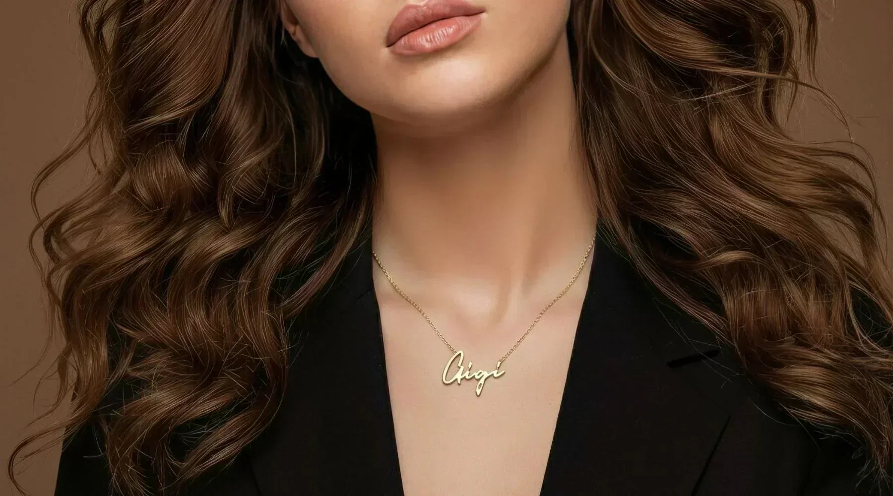
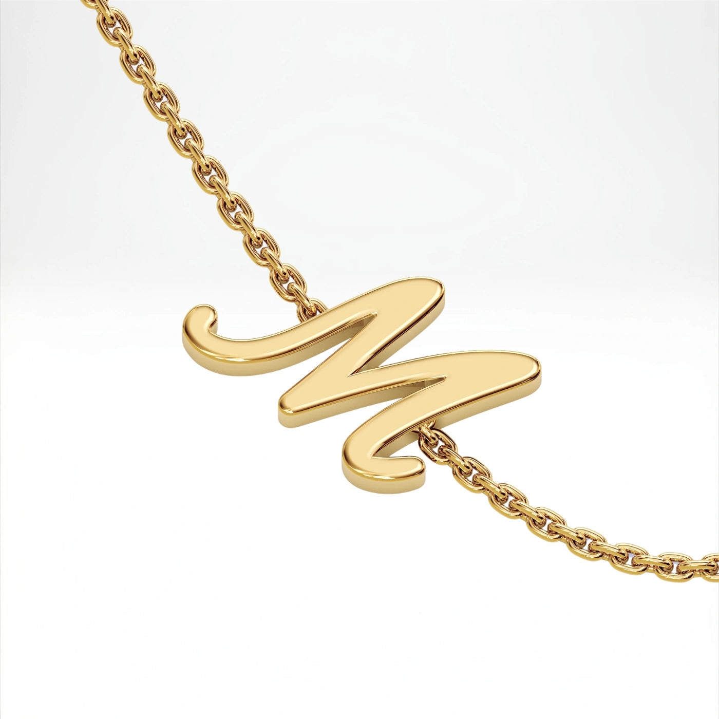
- Script fonts are flowing and romantic, with a more personal feel. Brush Script or Lobster-style letters make a diamond initial feel extra special, with a touch of whimsy reserved for occasions like an anniversary or Valentine's Day.
If you're still undecided after weighing style, occasion, size, and metal, this is usually the fastest way to narrow it down — pick the family first, then choose within it.
8. Personal Touches
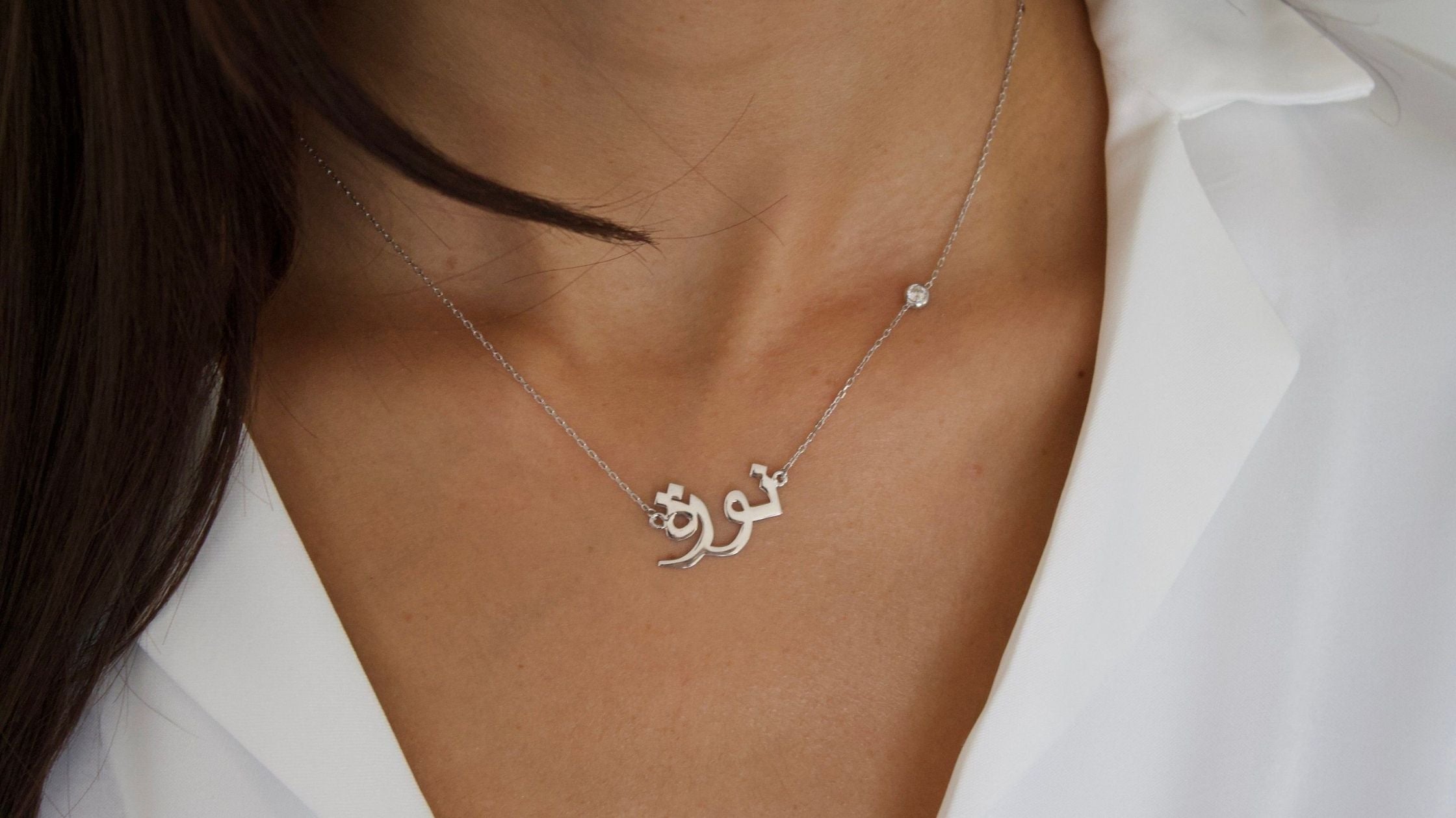
If you want to take the personal touch even further and wear something truly one of a kind, there's also hand lettering, offered by many jewellers. You can custom-draw a font yourself, or ask a partner to do it for you. It becomes their handwriting, sitting close to your heart.
This can reflect your personality in a way standard fonts simply can't. If you want something unique and meaningful, working with a jeweller on a personalised design is the way to go.
Test The Diamond Initial Necklace Font
After considering all of these factors, preview the font on your necklace design before you commit. There are online tools that can create a mock-up showing how the font may look on the pendant.
You can also consult your jeweller directly and ask for a visual mock-up. You get to see how the font actually looks alongside the diamonds and chain length — a small precaution that saves you from any regrets later, once the piece is made.
Read More: How to Style an Initial Necklace Like a Pro
Frequently Asked Questions
What font is best for a diamond initial necklace?
There's no single best option — it depends on your style, the metal, and how you'll wear it. Serif fonts suit a classic look, sans-serif suits modern minimalism, and script suits pieces with sentiment behind them.
Does the metal affect which font I should choose?
Yes. Gold tends to carry detailed, ornate fonts well, while white gold and silver flatter cleaner, simpler sans-serif letters.
Are script fonts hard to read on small pendants?
They can be, if the script is especially ornate. On smaller pendants, a cleaner script or a simpler font family reads more clearly at arm's length.
Can I use my own handwriting for a diamond initial necklace?
Yes — hand lettering, including your own or a loved one's handwriting, can be custom-made by working directly with a jeweller.
How do I know what a font will look like before I order?
Ask for a visual mock-up. Seeing the font against the actual diamonds and chain length is the most reliable way to confirm it's right before it's made.
What's the difference between serif, sans-serif, and script fonts on jewellery?
Serif fonts are traditional and elegant, sans-serif fonts are modern and minimalist, and script fonts are flowing and romantic — each suits a different personal style and occasion.
Choosing the right font for your diamond initial necklace is all about balancing personal style, readability, and the occasion. Whether you're after a bold, modern look or a timeless, elegant design, the font choice makes a real difference in how the necklace feels — not just how it photographs.
Argent & Asher's handcrafted jewellery is expertly made, designed to last a lifetime, and doesn't tarnish. Every piece, including our diamond initial necklaces, is made with attention to detail, ensuring you get a high-quality product that's both beautiful and meaningful, whichever font you land on.


Script Initial Necklace
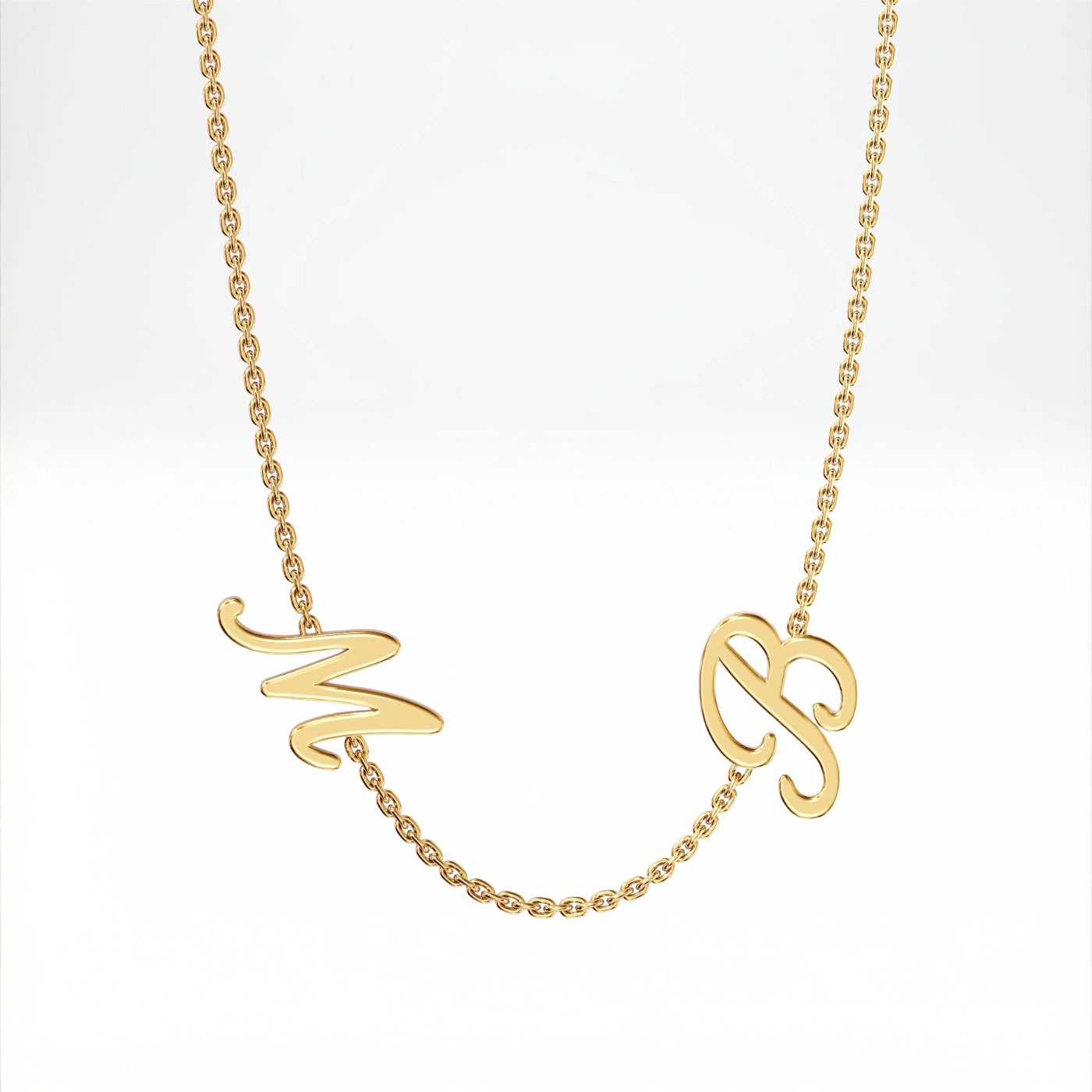
Double Initial Necklace

Written by Katie Silver